THE JOHN MILROY SELECTION
BY THE WHISKYFIND
BY THE WHISKYFIND
Label Design
2018-2019


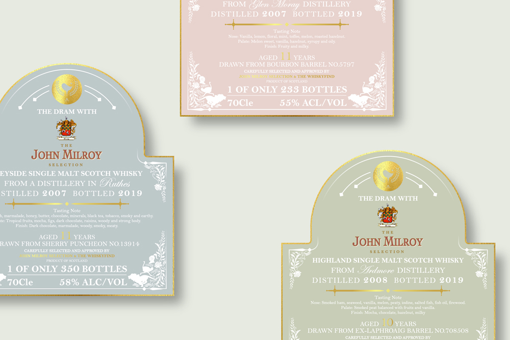
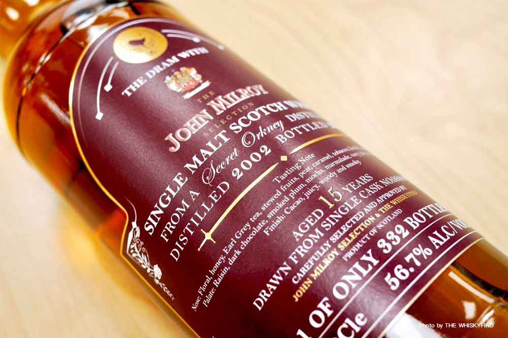
強米羅(John Milroy)從60年代開始進入蘇格蘭威士忌產業,他在倫敦的傳奇名店Milroy’s of Soho迄今仍是英國最重要的威士忌專賣店之一,他歷來的裝瓶風格鮮明,不論在香氣和味覺上面皆能感受到橡木桶的風味與酒廠性格的精彩交鋒。酒標外型的設計選用在倫敦蘇活區極具特色的壁畫輪廓、並使用John Milroy傳統家徽的元素去延伸、搭配鮮明的顏色運用。
John Milroy has been in the Scotch Whisky industry since the 1960s, and his legendary London store, Milroy's of Soho, is still one of the UK's most important whisky stores. His traditional bottling style is clear, both in aroma and taste, you can feel the wonderful flavor of the oak barrel and the character of the winery. The label's outline and design is inspired from the spirit of Soho mural in London, use the elements extended from John Milroy traditional family emblem and match with the vibrant colors.
Campany: 2byWu&Chen
Role: Visual Design
Client: The Whiskyfind
